Monday, December 9, 2013

Titian's Venus with a Mirror and Two Cupids

Titian, Venus with a Mirror and Two Cupids, 1555, oil on canvas, 124.5 x 105.5 cm.

Is not this just the most beautiful, decedent, luxurious thing your eyes have ever laid upon? It is thought that Titian loved this so much that he could not part with it and kept the original for himself, and for his visitors to admire. Many variations and copies were made by himself and his workshop. While Peter Humfrey, the author of my research text Titian, hardly touches on his painting, I wanted to discuss it because it is the sort of painting that captivates its viewer; a timeless beauty. 

I find that Venus has a very similar hair style to Diana from the previous paintings which I have discussed, Diana and Callisto and Diana and Diana and Actaeon. Although she is bedecked in jewels her skin seems to outshine them, and the ruby red jewel tones of her lips is reflected in her embroidered velvet cloak, which is barely covering her. 

Titian's use of color, contrasting red with dark shadings of green, and the rich textures of silks, jewels, velvet and furs create a very real and tangible setting for the senses which engages the viewer. Venus gazes into the mirror which two cupids are holding, and she seems to be gazing at herself as if somewhat surprised and modest about her beauty.

For one of Titian's later paintings Venus is very luminescent, much more reminiscent of his Venus of Urbino. However, the expressive strokes with which he rendered the material objects around her created a vivid atmosphere, in which his later style served him greatly. This can be seen in the bottom left corner of her velvet cloak, the roughness and painterly style of the strokes lend authenticity to the texture of the fabric. This is perhaps one of the most luxurious depictions of the goddess Venus that I have seen thus far, and it is entirely unique in that it does not simply focus on her body, but also compares her beauty to the most precious of materials and stones, and she entirely outshines every one of those objects.
Titian's Last Painting - The Pieta

Pieta, 1570- 1576, oil on canvas, 378 x 347 cm.

Towards the end of Titian's life he began to paint Pieta for the church of the Frari, where he wished to be buried. In the bottom right hand corner the viewer can see the painter himself and his son Orazio kneeling before Mary and Christ, in a small devotional tablet. However, upon examining the canvas it has been found that it is indeed made from several canvases, patched together as the composition evolved around the Virgin and Christ. But the evolution never came to be fully realized, as Titian and his son Orazio both died in an outbreak of the plague in August of 1576. 

The painting then passed into the hands of Palma Giovane who completed what Titian had left undone. It is speculated that really the only part which Palma worked on was the flying angel in the top right hand corner, as the rest of the painting is highly reminiscent of Titian's Death of Actaeon and its muted color pallet.  It is also thought that Titian was trying to show is humble awe and love for the sacrifice that Christ made by including some of his personal facial features into the kneeling Saint Jerome.

While Titian obviously knew his time to meet the Lord was coming, he was still cut short by the plague, of which few realized he actually had and attributed his death to fever instead. In the chaos of the outbreak there was not time or the organization to afford Titian and his son the funeral of a great renaissance painter, like Michelangelo had. Indeed, his grave was only marked by a simple tile in the Frari church until  half way through the nineteenth century. With no one left to defend their house or works of art, fellow artists helped themselves to the contents of Titian's home. 


Monday, December 2, 2013

Titian and Workshop Reproductions

Titian and Workshop, Diana and Callisto, 1560-1565

As a major high renaissance painter Titian had quite a lengthy process between sketching, preparing a canvas, and the actual finished product. This process would have left a whole lot of by product for his workshop and apprentices to work from, and Titian was not opposed to reproduction and interpretations of his previous accomplishments. Diana and Callisto  is a good example of this, most notably the differences between the original and the reproduction above is the fountain which has gained significant height, the shortened depth of field, and the added clothing to the figures. 

There is no telling exactly how much of a hand Titian had in all of these reproductions, at times they seem very true to his style, and others merely based upon his concept and composition. It is frequently possible to find various forms of brushwork on the canvas, and it appears that Titian would leave the majority of the reproduction to his workshop in the intermediate layers, and then work on the upper layers himself.  

Titian did not limit the reproductions of his work to paintings, he frequently turned towards printmaking at the end of his life, apparently for its efficiency in getting his images to the general public and circulated. A wonderful example of this is Adoration of the Trinity (La Gloria) by Cornelis Cort, after Titian in 1566. 
This print, is essentially the mirror image of the original, which was reproduced from Titian's studio, proves that the renaissance artist kept all forms of his preliminary sketches. Otherwise Cornelis Cort would not have had the material to work from in the area that the print was reproduced. Instead of going to see the actual famous painting, many of these reproductions were made from the cartoons and preliminary materials which Titian kept on record not only for his personal use, but also for those who belonged to his workshop. These reproductions serve as proof to his artistic method, despite the actual cartoons having been lost in modern day. 

Diana and Actaeon and Diana and Callisto - Titian

Diana and Actaeon- 1556-1559,Titian, Oil on canvas, 190.3x 207 cm  and Diana and Callisto - 1556-1559, Titian, Oil on canvas, 188 x 206 cm

Of the ten major mythological paintings that Titian created for King Philip of Spain,  Diana and Actaeon, and Diana and Callisto are said to be the most coherent of the pairs. Both of these paintings depict those who have betrayed Diana, the chaste goddess, in some way and the punishment that she bestows upon them. In Diana and Actaeon, Actaeon (the man on the left) stumbles upon Diana bathing. As punishment for laying eyes on her, Diana splashes Actaeon in the face, turning him into a stag for his own hounds to chase and then feast upon. 

In content Diana and Callisto is very similar. As one of Diana's nymphs Callisto also has committed to a life of virtue and chastity. However the god Jupiter wanted to sleep with Callisto, so he disguised himself as Diana, and forced her to betray her vow, thereby impregnating her. When she refused to undress to bathe with the other nymphs, Diana ordered her to undress and reveal her transgressions. Callisto was then expelled from the goddesses company, and turned into a bear in the wilderness. 

When looking at visual similarities, the first thing that might strike the viewer is the composition. Both groupings are nearly the same, and feature water at the base of the canvas, figures in the middle along with sculptural elements, and then landscape in the upper half of the canvas. One difference however, is that Titian enclosed the figures in Diana and Actaeon within a Gothic structure that seems to blend right in with the forest around it, where as in Diana and Callisto there are no architectural elements besides the fountain in the center. Also, both paintings depict the most climatic moment in both myths, that of the discovery. Titian ties to two paintings together by the stag motif. In Diana and Actaeon a stag skull hangs among the trees, a premonition of what is to come for Actaeon; in Diana and Callisto the fountain also features a stag, which references previous punishments executed by Diana. Titian also ties the two paintings together by painting in diagonally slung curtain, which serve almost as a frame, telling the viewer that the two paintings are meant to be viewed together. 

As for the style, Titian's brushwork is highly evident within these two paintings, creating a sense of luxury and wildness to the surrounding nature. This separates this pair from his previous mythological paintings such as Bacchus and Ariadne , where his strokes where much more smooth and created almost gem-like surfaces. These two paintings suggest a wildness, fierceness, and potential decay that its predecessors did not. Which may lead the viewer to questioning Diana, despite her virtuous intent, perhaps she is much too severe. 

Monday, November 25, 2013

The Last Judgement- Discussion 6

s
Last Judgement, Michelangelo, 1541, Sistine Chapel 

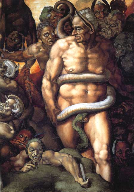
The three readings on Michelangelo's Last Judgement largely discussed the controversies surrounding its creation, unveiling, and interpretations. The first, entitled "Michelangelo's Last Judgement" discusses much of its creation.In order to prepare a surface, several pre-existing fresco's had to be destroyed, including those of Michelangelo himself and Perugino. The pigment, ultramarine, is also discussed for its expensive origins from the semi-precious stone lapis lazuli.  However the bulk of this article focuses on the choices that Michelangelo had to make when portraying this scene. From which passages would he chose? How would he depict those rising from the dead, versus angels, versus demons? It highlights that the figures were grouped, which was held together with the strength and cohesive use of the ultramarine blue, that the figures were all portrayed with extreme contraposto and as in their early thirties with strong physical qualities. There is little to differentiate angels from demons from saints from those rising from the dead.

This is where the second article entitled, "Reception of the Last Judgement", picks up. Largely focused on the controversy of the figures themselves, it focuses on the later revisions to the painting so make it "appropriate" enough to avoid destruction.
The next pope, and many other prominent religious figures thought that images such as this one entirely unsuitable for public eye. While this image was not covered with drapery, others, especially those of saints were covered and modified to fit what conservative images they where supposed to uphold for the average viewer's educational purposes. There is also the matter that Gilio, a  critic of the counter-reformation, argued that the figures where created with too much vigor and contortion. He argued that these graceful images might distract the viewer from the actual purpose of the painting, and lead them to only appreciate its aesthetic values. It was of his opinion that a figure should hold no more energy than the subject or action required, and that Michelangelo was simply showing off his artistic talents, and not focusing on the message at hand.

The third and final article, entitled "Michelangelo's Last Judgement as Merciful Heresy", focused on gleaning what beliefs Michelangelo possessed based on how he composed and executed the infamous fresco. For example, by looking at the indifferent face of Christ, as well as the somewhat ambiguous action his arm is making, it may be safe to assume that these gestures were meant to show that Christ was bringing both damnation and glory in the eyes of Michelangelo. That the event of the last judgement was to be both a celebration and the tragic end for those who walked the earth.

Sunday, November 3, 2013

Late Titian

Self Portrait, 1565-1670, Titian

According to Peter Humfrey's Titian, by his late sixties Titian had experienced great success riding on the ends of the high renaissance. He had gained a prestigious position as a favorite court painter of Philip II, of Spain. Despite having the favoritism of Phil ip and painting many scenes including six mythological paintings, Titian had no permanent home during this time, and lived in various parts of Europe.  Of these mythological paintings I will be studying Diana and Actaeon, 1556-1559, and Diana and Callisto, 1556-1559.
           
Diana and Actaeon                                                    Diana and Callisto

These two paintings are a pair, portraying the goddess virgin goddess Diana, punishing those who committed crimes against her; a hunter stumbling upon her bathing, and one of her nymphs betraying her vow and becoming pregnant. Throughout his time painting for Philip II, and after Titian always worked from and kept meticulous sketches. Many copies were produced from these sketches, by his workshop which consisted of, Orazio, Girlamo Dente, Christoph Schwartz, and potentially El Greco. While his workshop was mostly in charge of completing copies, Titian did have a had in them, at times heavier than others.

In his own works near the end of his eighty some years, Titian was criticized for a change in style which included looser brush strokes, and a potential loss in vision. Vasari  described it as such, "These last works are executed with bold, sweeping strokes, and in patches of colour, with the result that they cannot be viewed from near by...". Of these later paintings I will be studying the Self-Portrait above, Pieta, and several others in depth, to analyze the change in technique over time.   

Monday, October 28, 2013

Sir Anthony Blunt on Leonardo and Michelangelo - Discussion 4

 
Sir Anthony Blunt wrote extensively on the artist methods of both Leonardo and Michelangelo. What his analysis boils down to is that Leonardo is a master artist concerned with scientific procedure and accurateness, where as Michelangelo was a master artist concerned with pure aesthetics, at times bending the truth to please the eye. 

Leonardo is described as meticulously astute to the scientific nature of perspective and anatomy. He used these sciences to lend accuracy and beauty to his artworks, and according to Blunt maintained that even the media of painting was more noble and scientific than that of his fellow Michelangelo's sculpture. Painting is able to utilize color, aerial perspective, and depict luminescence better than sculpture can. Leonardo also greatly emphasized drawing from life, due to his belief that if one were to draw from a previous sketch it will become more and more "unnatural and mannered." Copying the work of another painter could also lead to this horrible fate, in Leonardo's eyes. 

  
While Leonardo was most opposed to mannered nature in artworks, it was not a concept that Michelangelo was opposed to. He, like Leonardo, dissected bodies to gain an intimate knowledge of anatomy, but did not fret over tweaking the bodily composition to further please the eye. At times he fiddles with figures, mostly those of women, to gain ideal musculature. In subject manner Michelangelo most always utilized biblical figures, and explored his own faith through them. His process was also significant spiritually, since he felt that one did not carve a sculpture, they simply unveiled what God had left inside to be discovered. 

To compare the two artists it to compare two kinds of fruit. Both are of the most talented to have ever lived, but neither are concerned with the same methodology or purpose. On one hand there is Leonardo, concerned with all things academic and the scientific nature of painting; on the other is Michelangelo, concerned with the will of God, and how best to please him and fulfill his spiritual life.